For the past two years I have sent out some poignant questions to the print buying community with two goals in mind; first and foremost to find out what they care about, and second with my Print Buyerologist hat on, help printers and suppliers understand what they care about, in a manner that will resonate.
The latter can sometimes be quite a challenge. Companies can get stuck in what THEY want to talk about vs. what potential customers and end-users of their products and services want to hear.
I am way more optimistic this year. The information flow seems to be heading in a more positive direction now that Gen-Xers are taking over the industry. They are more adaptable, proactive, and willing to take risks – with technology, customer communication, and with social media – in a manner I rarely experienced with the Baby Boomers. “This is the way it’s always been done” has given way to “Try it, let’s see what happens”. That is good news for everyone – especially print customers.
Survey Says…
The topic of my 2017 Print Buyer Survey was “Color, Quality and Consistency”. The industry talk track has been HEAVY about color management since last year, and it’s going to continue this year. I wanted to check in and see if print buyers cared as much about it as some would have you think… and they do, to some extent.
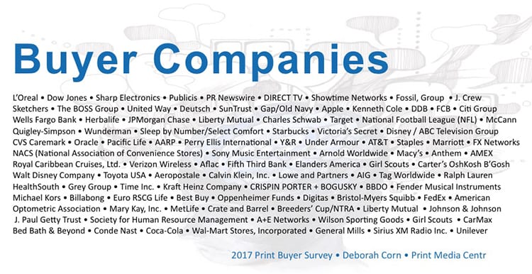
I sent a personal note to U.S. print buyers from the agencies and brands shown above, and more. I asked them to answer 12 questions via Survey Monkey under the topic of color, quality and consistency. Within 48 hours I had 100 responses, and a total of 142 when I shut it down. By the way, 67% of these buyers source print globally, so if you are a print provider out of the U.S. this still pertains to you – keep reading!
What did I learn…
QUALITY was the number one reason these buyers work with a printer, and the number one reason they reject jobs. That makes sense. However, I asked them to define “quality” in 50 words or less in an open field, and that’s when it got interesting.
In most of the first 100 responses, quality was measured by FINISHING in some form, in regard to whether they received an acceptable result for their job. NOT COLOR!
At first I was a bit surprised. Hearing the industry and the G7 people spouting about color and color management as often as I do I was hoping (for their sakes) that color would hold the top spot. But then it clicked in. During my 25+ years as a buyer working for some of the agencies and brands I surveyed, anytime I rejected a job or got hell over it, finishing was the culprit in all but a few really color critical instances. Things like scratched covers, uneven crossovers, and bad trimming are glaring issues in most cases, whereas whether or not the blue is the exact blue I specced, or close enough, is subjective in many ways – even with a pantone chip in hand.
To go one step further, out of those instances I rejected jobs and needed my sales person/CSR to make it right, the ones who did and proactively made sure the issues never happened again are the ones I still recommend today, regardless of where they are currently working.
My takeaway on this intel:
Don’t stop at color when you boast about your quality. Make sure customers have a clear understanding of what they should expect when they get their printed work delivered, and what they can expect if finishing issues arise. No one wants to admit to a potential customer that mistakes happen, but I promise you – buyers KNOW they do. Let them know up front how you handle it, and deliver on that promise. Tell them about your quality control process, and if you don’t have one in place, don’t call on these buyers.
Throughout the year I will be sharing more about my 2017 Print Buyer Survey here on PMC, in my LinkedIn Group Print Production Professionals, and during sessions I present at events. For now I wanted to help you strategize a little on how to do things differently, and dare to see what happens.
Finish Long and Prosper!
 Deborah Corn is the Intergalactic Ambassador to The Printerverse at PrintMediaCentr, a Print Buyerologist™, Integrated Marketer, Industry Speaker and Blogger, Cultivator of the Print Production Professionals Group, the #1 Print Group on LinkedIn, and host of #PrintChat, a weekly industry gathering on Twitter every Wednesday at 4PM ET. She has more than 25 years experience working in advertising and marketing, and currently works behind the scenes with printers, suppliers and industry organizations helping them to achieve success with their social media marketing endeavors, and meaningful relationships with customers.
Connect with Deborah: Twitter / Facebook / LinkedIn / Instagram / YouTube / Pinterest / Print Production Professionals Group / deborah@printmediacentr.com


28 Responses
Great Read…Thanks Deborah!
Great post Deborah! It is remarkable that color is subordinate to finishing but not surprising. A color that isn’t quite right is not as offensive as a bad crossover, cracking or uneven finishing. I can’t wait to read the balance of your survey results!
Cracking post Deborah, I agree with Jon, its amazing how badly a colour can go wrong if its not perfect.
I love it.
But of course it makes sense… I’ve yet to hear a “graphically observant” recipient of a mailpiece say that a logo looked too green. But there will be plenty of tsk-tsks if there’s a bad crossover, cracking, or a bad trim.
Totally agree! Great piece.
Deb, does it make sense to factor in the fact that people buying (especially from this first class list) have already okayed color on a press proof?
Very interesting.
Color consistency on press is always a give and take within reason. Finishing on the other hand is a lot more controllable. So I’m not surprised at the results.
Makes complete sense. Very well written
I have found that customers today just want ink on paper. We used to be able to explain what difference printing on a #1 coated sheet did with color versus a #3. But, Zeus forbid that a hook-up is off by 0.03125″.
Color is the key ingredient – the FIRST thing that Brand Owners and their representatives should measure, – with a special focus of course on the respective Brand Colors of their customer. My guess is that in general Brand Owners themselves are not aware of the importance of their colours being kept correct and why would their representatives make a big deal of checking colours as long as the finishing is pretty and smooth? It’s time to enlighten Brand Owners on the importance of color in their marketing. The “professionals” will not worry about them until they are told to do so by the guy with the wallet.
I enjoyed reading your article Deborah.
I’m convinced the key to a successful product and satisfied client is proactively investing in a preplanning meeting to clearly understand the clients expectations. Without this important step, a printer will risk producing a product based on their standards and assumptions.
Be a proactive listener and follow through in every aspect of the production process to deliver a quality product – exceeding the clients expectations!
Thanks Sandy…. ps I’ve worked with Cenveo and had a great experience 🙂
Just curious, is your business color related?
THANKS DON!!!!
The question was for them to define “quality” without any prompting. I cannot agree with your assumption based on that, or assumption that “press proofs” are being supplied to approve color.
Great article Deborah. It’s true that too often we have already decided what’s important to the buyer before asking. Thanks for sharing your research.
Deb,
This was a very good read. I especially like the fact that print buyers were willing to be specific when it came to quality. After 30 years in the business, it is refreshing to specifics instead of blankets!
Hi Deborah,
I think what may be overlooked here, especially since the contacts exist in top-tier, critical brand companies, is that color control/consistency/compliance is a given. Whether it’s ISO or G7 or vendor specific; you don’t get in the door if you can’t produce consistent color and in many cases, prove it.
Finish and print finishing related properties are more “I know it when I see it” type of quality attributes. So yes, show and tell! Show your plant, show your people, show your processes, show your results.
Another interesting question might have been who these buyers want to interact with. Bet it isn’t a salesperson… So attracting these type of clients is a “holistic” sell: See what WE can do for you.
Thanks for sharing this.
Hi Robert! Since I know other questions I asked, I can’t give you a blanket agreement on your “given” assumptions… though I will agree that these buyers are certainly more aware and perhaps even more focused on things like that when they choose printers to work with. It’s also important to note that the question was how they define QUALITY… it wasn’t related to color. They could have said “great color is quality to me”, but they didn’t. Most said finishing was how they measured quality.
It is very interesting, but not surprising, that finishing plays such a large role in this survey. In my experience it is something that is seldom discussed between printer and client until there is a problem. Then you know what hits the fan! It is one of the last operations of a project and if not done right it negates all the positive things that preceded it.
Hi Deborah,
Thanks so much for this feedback. Very important info that all printers should receive. Also wanted to thank you for giving a shout-out to the CSRs. They are the ones who live in the print trenches everyday.
Being a CSR in the Printing Industry is my career choice. There’s no better satisfaction than hearing a client say they loved their book and it was received on time. Quality begins with understanding the client and their needs. They trust in me to get their order printed, delivered on time and in great condition. Incidents inevitably occur and it’s the CSRs job to handle them in a professional and timely fashion to retain the client’s trust.
There’s so much more to quality than just ink on paper, you are correct. Coating, the finishing factor (especially the ‘lost art’ of spot lamination.) Quality goes all the way to the end of production too…the bindery in sewing, casing-in a book…is the spine imagery centered on the book, do the folios back up…right up to how the book is cartoned. Too tightly packed, the top book is damaged. Too loosely packed and the books will scratch in transit. The devil is in the details. A good printer thinks about all parts of production to obtain a quality product.
Looking forward to reading more of the results of your survey!
Thanks for sharing the research, makes sense and yes bad finishing can ruin a beautifully printed piece. Look forward to reading more.
Great insight & thought provoking article. Did you base your questions specifically around litho or did you include digital? Keep up the great work
Neither… the buyers answered the questions from their perspective in this case. Thanks for the comment – and question!
Interesting article, thanks for the research and sharing Deborah. I especially like the comment on print buyers appreciating the printer being transparent with issues. Having experience from both sides, and with the smaller margins printers are facing it is difficult for many to “fess up” until “caught”. A pro-active printer which the right processes in place could catch things earlier; “catch the drift” correct for wandering color or finishing issues but it may be too late to “tighten up” until the next run. The “catch 22” or dilemma from the printer’s perspective is just releasing the packaging, or having that conversation with the customer to release and correcting next time or just reprint and refinish!
Thanks for taking the time to share – and yes, a real QC process that flags and prempts “gotcha” moments woudl be nice 🙂