Last month’s Have QR Codes Finally Reached Their Glory Days? Blog post illustrated the resurgence of the QR code in marketing.
When looking through my mail the other day I decided to take a look at how companies are using the QR codes in their direct mail. The following direct mails were analyzed from both user experience and digital marketing perspectives.
Financial Services Virtual Event
The first mailer is an 8 page 8.5×11 inch saddle-stitched booklet that was folded in half for mailing.
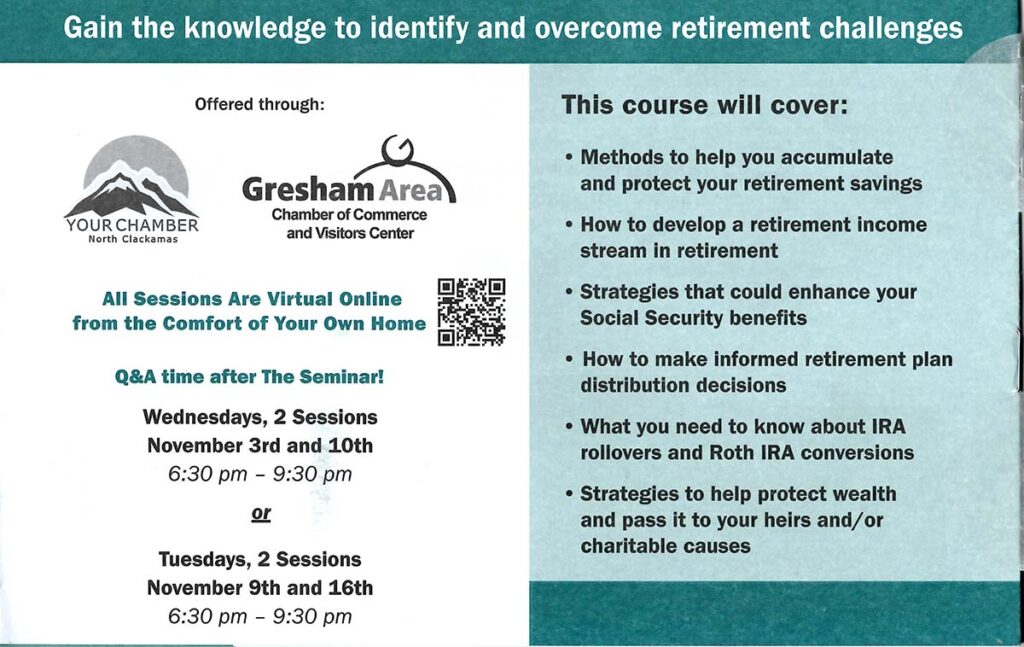
There was a QR code on the outside of the mailer but no information on what would happen when it was scanned. Instead of going to a landing page with additional information for the event, it went directly to the registration process. The registration form had one field on each page, which was slow to fill in and the prospect has no idea how much information they would need to provide.
The same QR code with a call-to-action was placed on the last page of the booklet. The placement and explanatory copy provide a much better experience.
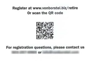
When scanned, the QR code sent me to the same page as the typed-in URL with an r=qr URL parameter added. This allows the digital marketer to know when the QR code was used.
Reactions:
- Using both QR code and text URL response mechanisms is effective for both mobile and laptop devices.
- The registration form was frustrating as there was only one field per page, making it slow and impossible to know how much information needed to be provided.
- The QR code on the outside of the mailer should be removed.
- The digital marketer can’t know which QR code was scanned. This would be useful information for improving subsequent campaigns.
Hotel Credit Card Offer
The next mailer was a three-panel self-mailer. One outside panel highlighted a compelling offer of 60,000 bonus points and no annual fees.
The address side had a QR code as a response mechanism with a clear Scan to learn more call-to-action.
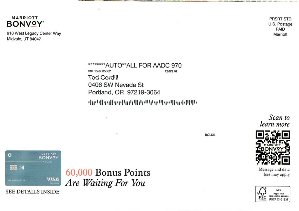
There was a similar QR code and call-to-action on an inside panel that went to the same page as the QR code on the outside of the mailer. Each QR code utilized different URL parameters that identified which code was scanned.
Reactions:
- The offer was very clear and compelling.
- The QR code response mechanism was very clear and easy to use.
- URL parameters provide data that tells which QR code was scanned. This can be very useful information for future mailer design and testing.
- There were no text URL or phone number response mechanisms, making this mail is useless for someone that doesn’t know how to use a QR code. It is also frustrating for someone that prefers to use a laptop computer.
Brick and Mortar Wine Store With a Mobile App
This 9” x 6” postcard for a wine store has a very clear offer that might be compelling for the right audience.
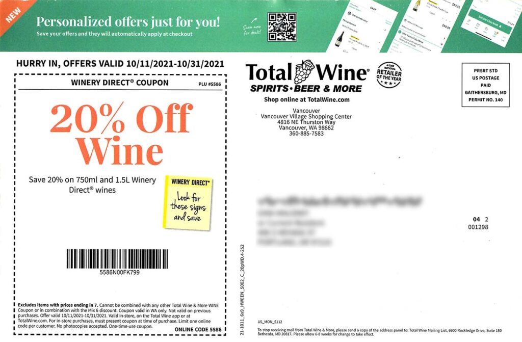
There are many actions the company is trying to get the customer to take:
- Download an app using the QR code
- Hurry In with a time-sensitive offer
- Order online with difficult to see URL and online coupon codes.
The Scan now for deals call-to-action positioned next to the QR code was way too small to read on the postcard.
The QR code goes directly to the iOS or Android app store to download an app, which is not obvious from the call-to-action.
Reactions:
- The 20% discount is a good solid offer and is prominently displayed.
- The call-to-action next to the QR code is difficult to read and does not set the right expectations.
- The mobile app that can be downloaded from the QR code is not mentioned anywhere in the mailer.
- Each of the three actions: visit the store, order online with a coupon code, or download the mobile app, should be clear and obvious. Three actions might be too many for this mailer.
Prescription Drugs Discount Card
This postcard had a heavy laminate and perforation that allows a membership card to be removed. There is a lot of dense information packed into this 5-5/8” x 4-1/4” mailer.
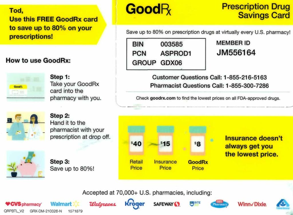
A yellow background highlights key messaging, including first name personalization. The benefit, which is Save up to 80%, is highlighted and mentioned twice, but it seems buried in the details.
The main response the company is trying to get is for the prospect to take the card to the pharmacy with their prescription to save a lot of money.
Additional details are provided on the address side.
The QR code and URL that can be typed in stand out, but the reason to download the app is buried in a block of very small text.
Scanning the QR code sends the prospect to the appropriate iOS or Android app store. Typing the URL in a computer goes to a well-designed landing page where the desired app store can be selected where the prospect can initiate downloading the app to their device.
Reactions:
- QR code and URL response mechanisms both work well.
- The benefit of downloading the app is buried in detail. This makes the overall user experience somewhat confusing.
- The benefit of possibly reducing prescription prices by 80% does stand out even though the text is small and the mailer is very busy.
Common QR Code Mistakes Marketers Make In Direct Mail
While user adoption of QR codes has increased, marketers often still seem to be struggling to use them to create a good user experience.
Common mistakes to avoid:
- Call-to-actions that do not make it clear what will happen when a prospect scans a QR code.
- Providing only a QR code and not an alternative response mechanism like a URL that can be typed or a phone number.
- Not encoding URLs to allow direct mail to be improved. To improve future campaigns, the digital marketer should know which QR codes are scanned and when text URLs are entered.
Using only a QR code makes sense with out-of-home usage where a smartphone will always be used. But with direct mail, prospects may prefer to use a laptop instead of their phone. Text URLs should always be provided as an alternative response mechanism.
QR codes are a bridge between the physical and digital worlds. Setting proper expectations and having a consistent design paradigm across channels is critical in creating an effective user experience.


One Response
I use more purls than QR codes. I like to use color in the QR code too. I am surprised how many people received a mailpiece to their business, and they still used their phone instead of the desktop computer to register. About 50 50 of people use a desktop v cell phone.