Can we please up our game? I yearn to see AMAZING print, but there are days when all I see is CRAPPY print. You see, I volunteer in the high school college and career center. When it’s slow, I file college brochures and viewbooks.
New brochures flow into the center daily, and the annual view books come in every year.
When colleges print the current year’s requirements, scholarships, tuition, and application deadlines, they send the info out to the high schools.
Printing this brochure every year is a chance for colleges to use cutting-edge design and the newest creative trends. It’s an opportunity to appeal very specifically to that year’s college-bound teen with THAT YEAR’S references and imagery.
Except they don’t.
When I sort and file the brochures, THEY ALL LOOK ALIKE. Year to year, month to month, day to day. Same.
Even colleges in vastly different climates still feature the same cliche’ photos:
- Administrators shaking hands (ugh!)
- Barefoot girl on grass blowing soap bubbles (predictablke).
- Professor looking bemused in front of a fireplace (bo-ring!).
- Millennials drinking coffee in the snack bar (been there, done that).
- Sport teammates with arms around each other (of course).
- Bell tower or campus landmark with logo superimposed (snore).
Over and over.
Same paper. Same saddle stitching. Same verbiage. Same. Same. Same.
Think about who we’re trying to talk to here with this printed material. TEENS!
If you want young people to pick your college, you absolutely have to portray it in print in a winning way.
As I flipped through the files, I pulled out two samples that were not like the others.
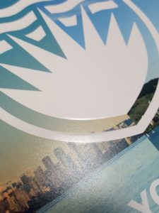
> University of Vancouver, B.C.
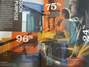
Big-city school with a world-famous economics program and an international student body. Crisp, upscale design, enticing textures. Professional photography with beautiful lighting, impressive statistics presented in a graphically pleasing way, a deep (touchable) emboss on the cover. Classy. Attractive. Different.
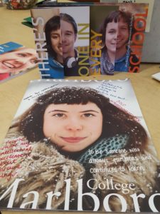
> Marlboro College in Vermont
Liberal arts college in the woods with a create-your-own major approach. Matte paper, excellent photo rendering on the subtly-shaded stock, oversized format, die cut windows, and hand-drawn art. Relevant and personal stories from real-looking students written in their true words, not polished by the administration. The size stands out. Muted colors but in really unusual shades. Interesting faces that catch your eye. Quirky.
I spent a good 15 minutes looking at each of these brochures. They pulled you in and kept you in.
Good print is immersive!
I know what you’re thinking. “We’re not the college. We’re just the printer (or designer, print sales person, print buyer, procurement officer, fill in the blank).”
True. However, if we’re the designated printer or buyer, and the college recruiting office comes to us with their annual print job that has been minimally updated and looks like — pardon me — CRAP! — then what’s wrong with saying, “It’s time for a redesign!”
If they are NOT your customer yet………………….
DO NOT launch a fresh, new relationship with a customer by merely reprinting a campaign that’s hideous.
DO NOT show them boring stuff that looks like their own boring stuff. Yes, I know you think that’s how you prove you can do the work. It’s not.
DO NOT drop off samples (boring or otherwise) for them to look at. Be there with them to explain the rationale, the processes, what’s new and what works.
DO NOT offend their design sensibilities. You can tell them “research shows” or “our experience with that market has proved…” and then back up your pitch with some real stats. Help them feel more comfortable with taking a risk…with YOU as their provider!
DO show them something different. Different is memorable! Dummy up something they won’t forget!
DO sit down with them and look at the best examples from similar colleges so they’re motivated to compete on a design level.
DO be honest about bad ideas. Say, “To be perfectly honest, we’ve done testing with the teen market, and they are not going to be impressed with this.”
If they’re fearful that they need to keep doing what everyone else is doing — that it’s better to be boring than take a risk — then you can help them do some split testing. You send their control piece to a portion of their list.
Then you take their hand and step it up together.
- Design a FABULOUS viewbook with tactile paper, unique binding techniques, lots of eye-popping color, fun processes like foil and die cuts, cool graphics like interactive maps and icons, thoughtfully-chosen typography, righteous page layout, and insanely memorable and actionable content.
- Aim for high quality photos that actually do justice to people of color (another pet peeve). Make sure the photos pop. Nothing muddy. Proper curves. People look at faces. The photos really are important.
- Print it right.
- Mail it to a portion of their list in an exciting envelope or package.
- Include a feature such as a trackable URL, a return postcard (yes, they still work!), a direct mail tracking app, or a scannable code or image that launches their personalized URL.
- Sizzle it up with printed electronics, augmented reality, or whatever you’ve always wanted to try.
- Give the reader a reward or gift for interacting with the brochure, and you make it clear in the packaging that there are incentives inside. (It’s not cheating to lure people inside your printed piece!)
- Provide the college with the jaw-dropping stats from the test run.
- Steer all new projects in a smarter, cooler direction because you’ve proved it works!
Guess what? This approach works with all the other print you are bidding on.
If you aren’t yet the printer of choice, GO CRAZY at your pitch meetings! You can’t lose a customer you don’t have!
Seriously, who’s going to fault you for suggesting something better?
If we want young people to love print as much as we do, we cannot be sending them this boring stuff at a time when they actually are interacting with print.
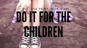
If you can’t do it for yourself and your company, then DO IT FOR THE CHILDREN!
Kick that boring print out the door. It’s your duty to make print amazing!
Read more from Sandy here.
 Sandy Hubbard is a marketing strategist for printing companies. She builds sales and marketing programs that can be sustained over the long haul, with affordable tools and your own people…without stress!


3 Responses
Yes, correct. Content and your media is the key when you advertise something offline. It’s the thing which can build or destroy your image.
Fabulous ideas, Sandy. If you’re going to bother going to print, why waste time and money on something boring. When you are doing the same things as everyone else, you are doing it wrong!
Thanks, Marc Zazeela, for the comment. You are one of the most creative thinkers in the international shipping space, so I appreciate your feedback.