Hi! I’m Chloe! I just got back from a trip and did my usual scan of the mail, and someone sent me, in 2016, a DM piece that is done in a typewriter font laser printed onto a preprinted shell. And then I opened a credit card statement for a new card I opened and it’s in a typewriter font – and worse, I swear it’s a 7 point font.
People! It’s 2016! Who does this? To protect the guilty I’m not naming names, but you know who you are!
Let’s start with the mailer. It’s a refinance offer. We get maybe a dozen a week. They are everything from the type that looks like a letter to the flashy post cards. Some are audacious enough to spit back my mortgage amount and interest rate where it can be seen by anyone, while others take the more subtle approach: “We can lower your monthly payment!” The one that got my ire up arrived in a pretty colorful envelope with a promise that it could save me money on my monthly house payment. I’ll open it and see what the offer looks like. You never know!
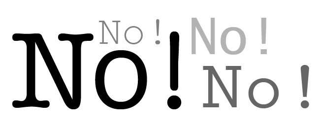
I tore it open and there it was. It looked like it came out of an IBM Selectric from the 1970s. Net, fixed pitch typewritten text, clearly laser printed and professionally folded. Even worse was the pitch.
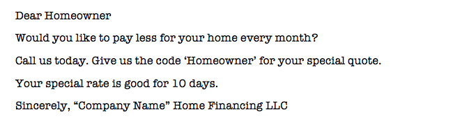
That’s all there was! But the envelope was truly well done and inviting, so this was an even bigger shock. And I wish it was the first time, but things come like this regularly, usually from companies I have never heard of.
Top Tip from Chloe
If you or your client are breaking into a new market or bringing a new company to the attention of the market, think about every aspect of the first contact. You can never re-do the first contact. In the case of the financing company, even if I later learned that they are rock solid and had the best deal, I’m not sure I could get over that first contact. All it would have taken to get my attention inside the envelope was a bit more style. A nice font, a bit more attention to the copywriting. Don’t be this company. Even if you have to go to FIVERR to get the copy written for you, it would be worth it.
Remember I said there were two disappointing pieces? The other was my first credit card statement. Yes, I still get them in the mail on paper. But this one was shocking because the type font was definitely a fixed pitch typewriter font, and it was very small.
I work with print everyday and I’ve worked with bills and statements for a long time. This piece is absolutely printed using a whitepaper workflow. There is a lot of subtle color on the paper, so why put the address and financial information in a typewriter font? Can someone actually believe that in 2016 this is a good design? That it’s easy to read? Does it even meet accessibility standards?
Now they have left me with a dilemma. Can I even carry this card? Oh, I looked online. The design and readability online is just fine. And that’s just not OK.
Until next time… Watch this space for more from the life of a Print Diva.
 Chloe Mahendra-Fuji practices the fine arts of design critique, content creation and editing, and communication consulting. She has decades of experience working in online content delivery, print delivery, and content development.
Connect with Chloe: @ChloePrintDiva / ChloePrintDiva@gmail.com