Optimism is in the wind. Things are picking up. People are feeling better.
The clue? Color.
People NEED color. They CRAVE color.
So if I’m right (and I think I am), we’re going to see printed items with vivid color. Print design trends often follow consumer preferences in retail, home furnishings, and fashion. Based on that, color is going to be big, BIG, BI-I-I-GGGG!
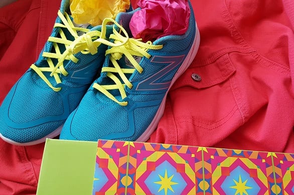
It’s going to be the YEAR OF COLOR.
With all this color flying around, there are trends impacting the design and print community:
- COLOR is clean and clear, with no gray, yellow or brown undertones. On the print side, this will require color integrity, because something that’s even one shade off isn’t going to hit that emotional note consumers are craving.
- PAPER is white. Bright white, chalk white, bone white. Think of coated papers and white-white uncoated options. This isn’t the blued whites we’re used to, where the blueing additives make the white look whiter. This is raw white.
- TYPE is black. Font sizes are extra large and readable, Messages are spare and clean. Typography is impeccable. To meet this trend, we’ll have to teach our customers to be concise and clear in their communications.
- INKS may require PMS call outs and extended gamut to hit the right tone. When shopping for digital print, be sure to print samples in the newest color combinations.
- SHEET SIZES are large. Tabloid publications will re-emerge. Wall art will be eye popping. Floor coverings and textiles will combine vivid palettes.
- PRINT QUALITY is flawless.
- LARGE FORMAT COLOR will predominate. All around us, from transit advertising to vehicle wraps to window displays, our colorful world will be more dazzling this year.
Consumers will fall in love with color on everything.
This isn’t the color palette of yesteryear:
OUT: Dusty hues, pastels, gray, beige, “greige.”
IN: Bright pinks, vivid Kelly greens, crisp cobalt blues, daffodil yellows, and true reds that all look great together.
OUT: “Good enough” color, boring color combinations, depressing palettes, unattractive visuals.
IN: Color coordination (not necessarily color matching), color print ads, colorful packaging, eye-catching point of purchase graphics.
OUT: Grayed-out type, too-small fonts, hard-to-read typestyles.
IN: Simplicity, stark san serif typefaces, no ornamentation.
OUT: Anything that is ambiguous, boring, ugly or pessimistic.
IN: Honesty, clarity, and transparency in print and digital communication.
Wrap it all up in refreshing color that POPS!
P.S. My teenager has worn black t-shirts, pants and shoes since he was in kindergarten. Today, he bought shirts in startling pink, saturated turquoise, and eye-blinding chartreuse. Teens can spot trends before we do and often lead the way. If they love color, watch out!
 Sandy Hubbard is a growth marketer and business strategist specializing in printing companies. She builds growth programs that get quick results and make a difference.









7 Responses
We are already in production with some eye-popping projects. We have also been asked about glitter and have had some fun samples to work on. Looking forward to seeing more of that as well.
I have read lot of ideas about new stunning pallets, but this one is different and it’s awesome. Using this colors you can make your own color pallet and become more creative.
Beautiful, I can’t wait to start using these colors in my mock ups.
Thanks for your comments, Kimberly. Glitter and textures plus color will make print stand out, for sure!
I like the new color palettes but I think they should be even more vivid! It might be hard to reproduce these colors with CMYK and you might need an extended gamut…or maybe use inkjet!
With vivid palettes, you’ll be ahead of the curve, Alexandria, and clients will realize what a trend setter you are!