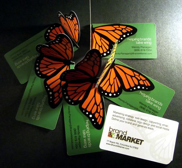
Hello fellow print and paper lovers! Today we’re going to do something a little different. A few weeks ago, I happened to see a post in the awesome re:Design Google Plus community by Wendy Flanagan. She posted pictures of her new die cut business cards, and I fell in love at first sight. I knew you would dig her creative cards as much as I do, so I thought it would be fun to do a mini interview with Wendy to explore her design process. (Full disclosure: I am now a group moderator for re:Design, although I wasn’t when I met Wendy.)
Business Card Design Interview with Wendy Flanagan
Q1) Please give us a brief history of your background.

Having graduated the Cooper Union as an Art major, I started my career as a Graphic Designer with my dad’s agency, Murray. Over twenty years, I worked in every capacity, Designer, Creative Director, Account Manager, New Business Development, Marketing Consultant, and finally Principal in 2001. My agency served accounts such as Johnson & Johnson, ADT, ADP, Novartis, and Verizon Wireless. I’ve been recognized as NJ Biz 50 Best Women in Business and inducted into the Advertising Hall of Fame of NJ. For six years, I orchestrated bi-annual events for the NJ Marcom Council (gala functions attracting over 300 marketing and advertising professionals to network in NJ).
After eight years of amazing work for Fortune-level companies, I parted ways with the firm to start my own marketing and design consulting practice, Brand4Market. I love being completely engrossed in my clients’ industries, being their “go-to” person 24/7 for print, web, and social media marketing. I continue to hold leadership roles for non-profit Marketing organizations; I currently serving as the MarCom Chair on the Board of Directors for the Marketing Executives Networking Group (MENG).
Q2) How many sets of business cards have you designed for your personal branding?
Since 2010, this is my third set of business card designs for Brand4Market. I had an inexpensive, plain text card the first pass; the second featured my picture on the card (like a realtor); and finally this third version is committed to demanding attention through creativity. The Monarch was chosen as my brand with the tagline “helping brands take wing“. My approach to marketing is to create a series of ‘brand instances’ that together define the brand in the mind of the audience. I think of this approach like the Monarch butterfly: having a very special individual appearance, but then dominating the landscape during their mass migrations of thousands of miles.
Q3) What inspired you to choose this creative die cut? Walk us through your creative process.
Since my original background was in print design, I’ve always been a fan of printing techniques that allow for distinction: blind emboss, custom die cut, foil stamp, spot UV, lenticular, etc. I had started an online search for affordable spot UV for a customer, and stumbled across a printer who would also allow a custom die cut – somewhat affordably.
I have to admit, it took some time before I committed to the die cut. Not because of expense, but out of consideration for potential audience perception. I want to be recognized as the Senior Marketing Executive that I am; not exclusively a Designer. Most of my work consists of Marketing and Content Strategy for web and social media marketing.
Q4) What were your goals for the custom cards?
Since I do a lot of networking, I wanted a card that was immediately unique and memorable. I’ve always been a fan of dimensional paper – having quite a collection of pop-up books – and the custom die cut added just the extra bit of “wow” that I felt would differentiate me from countless other marketers.
Q5) Have you handed these out in person yet? What reaction did you get?
I’ve started using my new cards this week, and response has been amazing. People are blown away by the card. The combination of bold colors with the die cut really catches their attention. I think many people wish that their card was truly an extension of their brand, personality and creativity – but they’re either unable to justify the expense or unable to make a commitment to a bold statement. I feel that you only have a split second to catch someone’s attention, and I want that person to walk away thinking, “Wow, that’s an interesting and creative business card. I wonder what else she does?” For now, it’s really my only sales ‘leave behind’ and I hope it leaves people wanting to know more.
Project Specs
The cards were printed by TasteofInk.com, a company who specializes in unique branding solutions. Wendy’s cards feature a custom butterfly die cut and fold, 4/4 with a satin finish plus spot UV on both sides. Great job, everyone!
Katherine serves as the Online Marketing Director at PrintFirm.com. She fell into online marketing in 2010, and built her career around this dynamic field. She earned her B.A. in Political Science from California State University, Northridge (Summa). When she’s not writing, Katherine enjoys photography, skateboarding, graphic design, and chasing her dog around with her husband.
Connect with Katherine on Facebook G+ and LinkedIn – and follow @PrintFirm on Twitter


