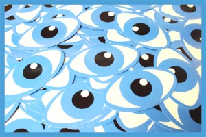
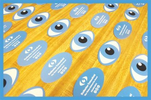
Everyone needs a business card that truly represents his or her personality. I got company cards for work, but to me these are an expression of the firm’s brand identity, not mine as an individual. For fun and practice, I decided to design cards for my personal brand as a creative professional. I wrote up a project overview to shed some light on the design process, and hopefully inspire you to make your own unique cards. Mainly I want to show the importance of business cards and explain the amount of thought that goes into designing these networking tools. I’m pretty pleased with the finished product, but it sure didn’t happen overnight!
The Image Problem
My job title sounds a bit vague; I mean, what does an online marketing director actually do? Like many people in the work force, I wear multiple hats on a daily basis. I develop content marketing strategies based on keywords, build links, post on social media, write content, design images for the web, and that’s before noon. Then there’s my personal passion for photography, which warrants recognition in my book. As a result, I found it difficult to hone in on a specific skill set in my layout. Should my business card focus on writing? What about social media? No, SEO! Wait, what about design?
I had plenty of ideas as to how to illustrate my daily tasks, but none formed a cohesive picture of my capabilities. I felt that by zeroing in on a single task, I would automatically deemphasize everything else. So I toyed with the concept of folded business cards. Each side of the card could serve as a space for a different facet of my career. That would have worked; however, I decided it would be best to come up with a single symbol that conveys everything (well, most everything) simultaneously.
The Graphic Solution
A gifted musician friend of mine named Al Corrao once paid me a wonderful compliment that gave this project direction:
You have The Eye. The Artist’s Lens. The Camera allows the rest of us to see/feel what you do.”
The language Al used comes up in many types of visually creative pursuits. It does not normally imply talent for writing or superior critical thinking (an unappreciated trait among successful SEOs). Nevertheless, I see a clear connection because you can’t implement a solid content strategy unless you see the big picture, the marketing vision. With that in mind, I give you The Artist’s Eye on oval shaped 14pt. cardstock:

Campaign Results and Reactions

Since these have my personal phone number on them, I’m being pretty selective about who I give them to. I will be passing them out at the John Van Hammersveld exhibition on Oct. 12th, which will serve as a good test for the campaign. It’s not easy to stand out in that type of environment, a place filled with art lovers and critics. I did a little preliminary experiment at my local independent market. I gave the cards to 3 employees, and they all gave me positive feedback. They did seem intrigued by the unusual shape as well as the artwork, and actually turned the cards over a few times with their hands before slipping them into their pockets. That’s the true sign of a pro business card, whether it maintains the recipient’s attention for longer than a 3 second glance.
How would you react if someone handed you an eyeball business card? What’s the craziest card you’ve ever seen or made?
Katherine serves as the Online Marketing Director at PrintFirm.com. She fell into online marketing in 2010, and built her career around this dynamic field. She earned her B.A. in Political Science from California State University, Northridge (Summa). When she’s not writing, Katherine enjoys photography, skateboarding, graphic design, and chasing her dog around with her husband.
Connect with Katherine on Facebook G+ and LinkedIn – and follow @PrintFirm on Twitter


4 Responses
These are so cool and creative. I would totally save this and also use as an example of how to think out of the biz card box – especially shape wise!
Thanks Deborah! I’d be honored to send you a couple.
Is it any coincidence that your personal business cards are shaped like the deck on a skateboard? 🙂
OMG Sandy, I seriously didn’t realize that until now. Brilliant! Now I love them even more.