 By Katherine Tattersfield, Print Geek
I love catalogs. Ever since I got my hands on a JC Penny Christmas catalog when I was about 5 years old, I’ve been hooked on these print marketing tools. I remember impatiently waiting for holiday catalogs to arrive so I could make my list for Santa. My mother still recalls the day I got my first American Girls catalog at age 8; her wallet will never recover from those dolls and their adorable accessories. Hey, at least they were educational!
My catalog love affair never faded, but now I that I work in the printing industry, I see these campaigns from a professional advertising perspective. I still scope out the inventory, only I also consider the overall layout along with other design considerations. Today I want to share what I think is an excellent example of a catalog design from Swell.com, an ecommerce site for surf/skate apparel and accessories. I discovered the site while searching for board shorts for my very picky husband, and that’s how I ended up on their mailing list. I’ve made a few purchases in the last couple of years, so I’m an example of a repeat customer taking the catalog bait to make a purchase online. I leave their catalogs on my coffee table for guests to enjoy, another big bonus for their brand. My friends leaf through them all the time, and most have never heard of Swell before. I doubt any of my friends have made a purchase, but at least they’re aware of the brand’s existence.
What Makes the Swell Catalog Design Work

Most of the clothes Swell sells come from my favorite surf and skate brands, such as Billabong and Vans. But tons of major retailors offer the same products, so my Swell connection goes deeper than just the gear. What makes me hang on to the catalogs instead of just tossing them is their lifestyle angle. The Swell brand concentrates more on aligning the company with the sophisticated side of SoCal beach culture. They don’t get down and dirty or embrace street art; they portray surfing in particular with an almost preppy vibe. While they do give the impression that surfing is a hobby for upper class wasps, I give them points for showing action sports in a mature way. They also get that surfers and skaters are not perpetually 15. We grow up just like everyone else, and shouldn’t be fed a marketing message made for high schoolers. Then there’s the fact that they use full page and two page ads for specific brands in each issue that make the piece seem like a magazine.
Men’s Design vs. Women’s
Swell segments their mailing list by producing two separate catalogs for dudes and chicks. I’m on the guys list because my original order was for my husband. Thankfully, they include a few pages at the end with stuff for the opposite gender. If I want to see the full female version, I can always get a digital fix on their site where they publish the same seasonal spread online. I have noticed several interesting differences in the guys’ catalog vs. the girls’, which I’ll explain below.
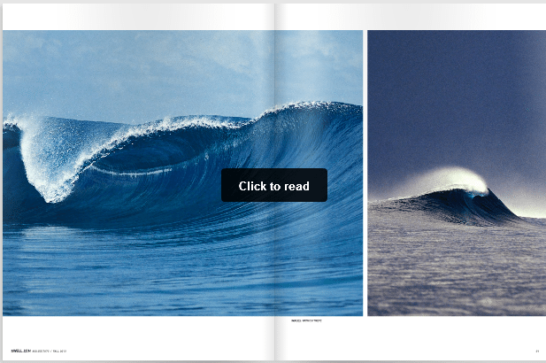
I actually prefer the Men’s catalog for one reason: epic photography. I’m not sure if the brands use these print ads in other places or if they’re made especially for Swell. Either way, they’re packed with amazing shots of massive waves and pristine coastlines from exotic surf spots. The pictures remind me of the photos in Surfer magazine I used to tape to the inside of my locker. The cover design always features this type of photo rather than a straightforward ad, which I find enticing as a consumer. The Men’s clothing lines are shown as individual pieces with a lot on each page. The pants aren’t so smashed together, but the shirts could use a bit of white space. That’s really my only criticism as everything else is on point from the messaging to the copy.
The women’s catalog works better as far as the product photos. They obviously get that us girls prefer to see entire outfits rather than just shirts or pants. Maybe that’s why the guys version doesn’t do much for me; I’m outside of the target market and therefore not in a position to make an adequate assessment. Perhaps we can get a guy’s opinion—any male readers care to chime in? Would you rather see clothes in a catalog as separate items or grouped together as outfits? Let me know in the comments below!
Katherine serves as the Online Marketing Director at PrintFirm.com. She fell into online marketing in 2010, and built her career around this dynamic field. She earned her B.A. in Political Science from California State University, Northridge (Summa). When she’s not writing, Katherine enjoys photography, skateboarding, graphic design, and chasing her dog around with her husband.
Connect with Katherine on Facebook G+ and LinkedIn – and follow @PrintFirm on Twitter


