It never clicked that the Queen is always dressed in one color – until now. What a cool and creative way to celebrate the Jubilee and have a souvenir (besides maybe a shot glass) that will actually be used! I WANT ONE! …. oh NIGEL
Pantone Queen // 60 Years Of Matching Colour
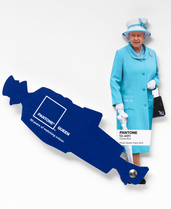
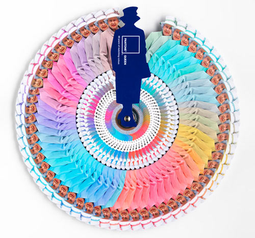
It has been 60 years since Queen Elizabeth II’s coronation onto the throne in Britain. The Diamond Jubilee celebration is well underway and we are here to share not only the popularity of the monarchy, but the array of colours that have defined the stylish consistency of the Queen over the past 6 decades. Colour was the premise to the collaboration between Pantone and Leo Burnett London as they team up to bring you a limited edition colour guide of the Queen’s coordinated ensembles. The guide is numbered featuring PANTONE Colour references citing the date and location that defines the queen’s choice. So, next time you are selecting the swatches to a stationery system or defining the palette of your next poster, let her Royal Highness, the Queen assist you in the matter.
Colour is powerful and often used with purpose; something that the Queen has learned over the years. We have witnessed some of her most notable moments in her reign through the colour she wore on any particular occasion. The Queen is notorious for wearing monochromatic ensembles that make her appear taller; this shifts the focus to her rather than any distraction that may be caused by a disarray of colours. We are all too familiar with seeing celebrities and their style choices parading the red carpet; the Queen of England will always be dressed in one colour, this alone leaves plenty to talk about. So next time you notice a particular colour, think about the occasion and what Queen Elizabeth was doing when she wore it; we are pretty sure it was important.
 Selecting feature colours from the Queen’s wardrobe, Leatrice Eiseman, executive director of the Pantone Colour Institute®, reflects on some of the most notable colour selections:
>>> PANTONE 13-0755 Primrose Yellow ”The Queen’s royal wedding outfit from 2011 was Primrose Yellow. Yellow is a colour that speaks to the future with hope and optimism. William’s wedding was a time of national celebration and this choice of yellow complements the joyous mood of the occasion. It’s a colour that is high visibility (befitting a queen), while still not detracting from the bride.”
>>> PANTONE 13-4411 Crystal Blue ”Blue is a colour staple in the Queen’s wardrobe. It’s a colour that communicates constancy and it is also symbolic of her devotion to the British people. Blues traditionally have calming properties and she is often seen wearing them during difficult times. Blue is also seen as de-stressing so it’s no surprise she was sporting a serene blue to a Royal Garden Party in 2010.”
>>> PANTONE 16-2124 Pink Carnation ”Queen Elizabeth wore lighter tones of pink more frequently when she was younger, adding softness to her role as Queen and making her seem less austere. The PANTONE 16-2124 Pink Carnation she wore to the Chelsea Garden Party in 1967 is a good example. In recent years however, she has been seen in trendier bright pinks, defying her age and communicating that she is a monarch modern in thought and spirit.”
>>> PANTONE 13-5414 Ice Green ”During the Queen’s landmark state visit to Ireland, the first since the country gained independence in the 1920s, she was seen in a cool shade of green. Her colour choice echoed the sentiment of her visit as green is widely seen to symbolise new beginnings, fresh thoughts and rejuvenation.”
More info/credits here Pantone Queen // 60 Years Of Matching Colour | Yatzer.


2 Responses
Are there printed books of the queens colors? If so, I would appreciate a link to purchase one.
They were created as limited editions. Every now and then 1 will pop up on Ebay – but its a rare find!