 Fellow print geeks, does the name John Van Hamersveld ring a bell? No? Surely you’ve seen the iconic Endless Summer movie poster or the cover of the Beatles legendary Magical Mystery Tour album. If so, then you’re already familiar with this bad ass designer, you just need to put his name/face to his incredible body of work. Those of you in the LA area are in luck because John’s work is on display from now until Oct. 12th at my alma mater, California State University, Northridge. The exhibition entitled Drawing Attention features 84 of his most popular prints that span 45 years of his career as the artistic ambassador of psychedelic surf culture. Please join me at the CSUN art galleries for an exclusive lecture and book signing with the man himself on Oct 12th from 1pm to 4pm.
An Introduction to the Artist
Those of you who haven’t heard about Van Hamersveld should really get acquainted with this unique talent. For starters, Van Hamersveld primarily creates print pieces, including album art, posters, product packaging, magazine covers, and book covers. He often initiates the creative process with detailed hand drawings and transforms them into digital images. He held prestigious positions as the art director for Surfer Magazine and handled projects for Capitol Records, hence his connection to the 60s and 70s counterculture.
In the 1980s, Hamersveld branched out into more conventional projects, notably the 1984 Olympics poster for the Summer games at the Los Angeles Coliseum. He’s also responsible for the Fat Burger logo and brand identity. He currently owns CoolHous studio in Santa Monica and promotes his earlier works through a line of products he calls “Post-Future.”
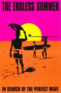
The Intersection of Photography and Poster Design
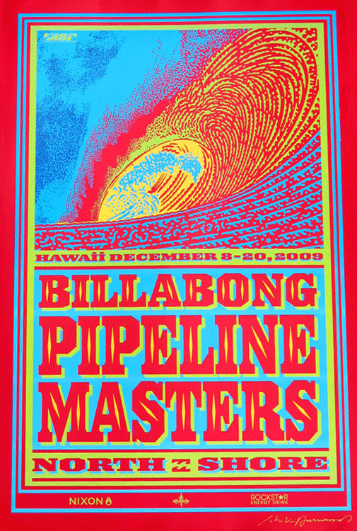
I love Van Hamersveld for lots of reasons, and the Endless Summer poster will always have a special place in my heart. I have a framed copy of the 50th anniversary version hanging in my living room above my coach, which is where I usually sit when I’m doing my own creative work. The bold colors and simple graphic get lots of comments from my friends and neighbors.
What makes the design so compelling to me is the fact that it came from a photograph. At age 22, Van Hamersveld decided to capture the film’s creator along with the 2 stars standing on the beach with their boards. From there he simplified the elements to a bare minimum of 3 silhouettes facing a day glo sun in the center against a high contrast neon background. I’m hoping Van Hamersveld will do me the honor of autographing the poster print when he signs my copy of his book on the 12th.
Katherine serves as the Online Marketing Director at PrintFirm.com. She fell into online marketing in 2010, and built her career around this dynamic field. She earned her B.A. in Political Science from California State University, Northridge (Summa). When she’s not writing, Katherine enjoys photography, skateboarding, graphic design, and chasing her dog around with her husband.
Connect with Katherine on Facebook G+ and LinkedIn – and follow @PrintFirm on Twitter