 With a growing number of consumers searching for products and services on mobile devices, your mobile presence will need to be examined or re-examined to stay in the game for 2013 and beyond. My suggestion is not to jump on the first on the first drop and drag software solution out there, but to work on your mobile site with as much care as I imagine you have put into your website.
For example, what are your goals? What information needs to be easily accessible and READABLE on a 3″ screen? What information can you do without to keep the site running with smaller load time, and keep people from bouncing off it? A mobile site is not about recreating your current site for a smartphone view (or tablet in some cases), it’s about creating and experience for those devices, and a worthwhile one at that.
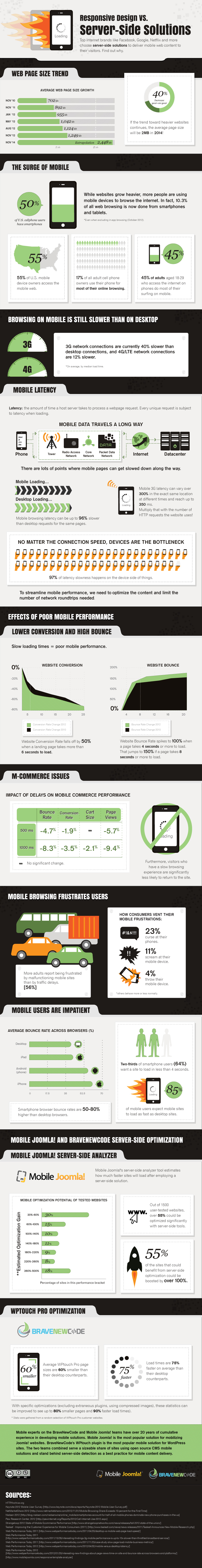
The infographic below highlights the effects of slow loading mobile sites, and if you are a WordPress or Joomla user (which many of us are) there are some plugins to check out to help you get started and stay on the faster side of the mobile media highway.
VIA: Why Responsive Design May Be Wrong For Your Site [Infographic]

