 I am long standing fan of Rider Dickerson because they “get” it. They get that providing education to Print Buyers helps everyone. They get that multi-channel marketing is here to stay and have been ahead of the curve for years producing their own annual event in Chicago called printFORUM. They get social media. And they certainly get that a Printer’s Promotional piece should be a work of art.
Most of the time when I get a package from a Printer it contains samples they printed for clients. That is great, I can see what other people are creating and how they produced it, but those samples don’t tell me anything about the Printer. I would so much rather have a package that contains an awesomely designed and executed self-promotion which highlights as many printing techniques and finishes you can fit in before moving towards tacky.
Use this opportunity to tell me the story of your business and tell me the story of the promo piece… how many processes, inks, finishes, folds, paper stocks etc etc. You are basically letting me know your capabilities without listing them on a sheet or asking me to review them on your site. There is really nothing more boring to receive in a package then a capabilities list.
Think about it… Invest in your own materials and show you care so we can care about you. Rider does, and it works.
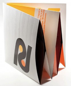
More than just another print shop promotion piece, Faust’s perforated origami poster for Rider Dickerson is an ever-unfolding ink-xperience. — KELLY CREE
The challenge was to create an immersive experience that would grab your attention immediately, draw you in continually and remain top of mind long after it is closed and left on the desk. The message needed to convey premium quality craft, but more importantly position Rider Dickerson as a strategic communications partner, not simply another good print shop. Our solution was “More Than Ink:” 1. An “unzippable” package made of uncoated folding board with a custom perforation. 2. An origami inspired folder based on the “more than” symbol, printed with double hits of fluorescent inks, as well as spot hi gloss uv and spot soft-touch finishes. 3. Three insert sheets: The first printed 4-color offset on a gloss coated sheet with spot dull varnish, the second printed digitally with five hits of opaque white ink on uncoated paper, and the last, used to house two tipped on plastic calling cards with QR code call to actions. 4. Finally the whole piece unfolds into a full-sized poster produced in 4-color process on a metallic foil laminate further enhanced with a spot hi gloss UV coating. The whole experience is a “glowing” testament to a great print partner.

